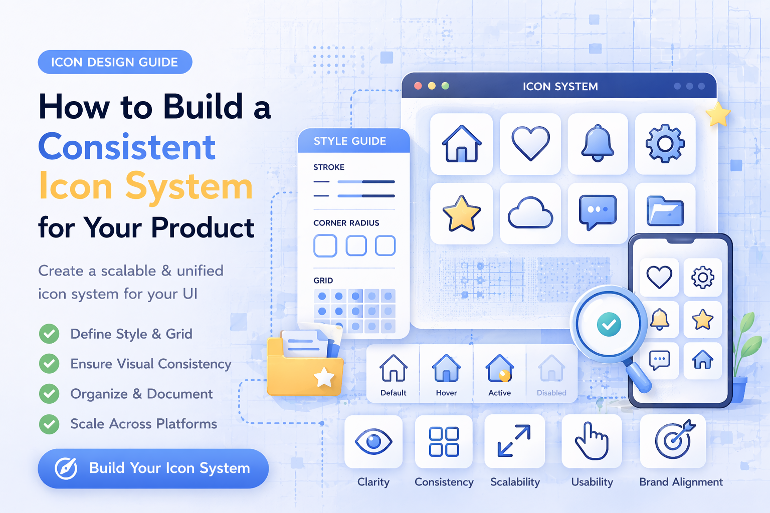
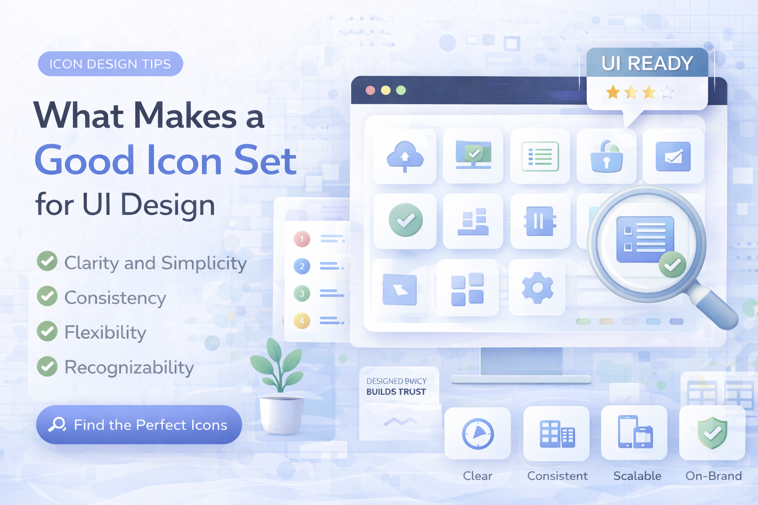
Featured

SVG vs PNG vs JPG vs EPS Icons: What Format Should You Use?

Learn the difference between SVG, PNG, JPG, and EPS icons and choose the best format for UI design, websites, apps, and commercial projects.

Vectizon • Apr 16, 20263 min read

SVG vs PNG vs JPG vs EPS Icons: What Format Should You Use?

Latest Articles

SVG vs PNG Icons: Which Format Works Best?

SVG vs PNG Icons: Which Format Works Best?

Vectizon • Apr 16, 20261 min read

SVG and PNG both matter in real product workflows, but they solve different problems. When SVG is the better choice You need sharp scaling across many screen sizes. You want to ...

Best Icons for SaaS UI: A Practical Selection Guide

Best Icons for SaaS UI: A Practical Selection Guide

Vectizon • Apr 15, 20261 min read

SaaS interfaces depend on fast recognition. Good icon choices reduce friction in navigation and actions. What to prioritize first Consistent visual style across the full product...

How to Use Icons in Web Design Without Visual Noise

How to Use Icons in Web Design Without Visual Noise

Vectizon • Apr 14, 20261 min read

Icons should support content, not compete with it. Size and spacing basics Keep icon sizes tied to your type scale. Use consistent padding around icon+label pairs. Avoid mixing ...

Outline vs Glyph Icons: Which Style Should You Choose?

Outline vs Glyph Icons: Which Style Should You Choose?

Vectizon • Apr 13, 20261 min read

Outline and glyph icons each have strengths. The right choice depends on context, density, and brand tone. Outline icons Best when you need: lighter visual weight modern interfa...

Free vs Premium Icons: How to Decide for Real Projects

Free vs Premium Icons: How to Decide for Real Projects

Vectizon • Apr 12, 20261 min read

Free icons are great for quick starts. Premium libraries become valuable when teams need speed and consistency. Free icon advantages zero upfront cost good for prototypes useful...